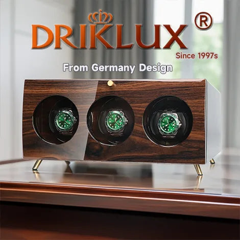


How To Match Watch Winder Wood Grains With Hardwood Flooring And Cabinets

Table of Contents
- Overview and Key Concepts
- Technical Specifications
- Expert Best Practices
- Common Challenges
- Buying Considerations
- FAQs
- Conclusion
Matching a watch winder’s wood grain to hardwood flooring and cabinets is about visual balance, not perfect duplication. The best collector-grade result comes from aligning undertones, grain intensity, and finish sheen so the winder looks intentional beside the room’s millwork rather than like a separate object.
You can find more information about choosing the right watch winder in our guide.
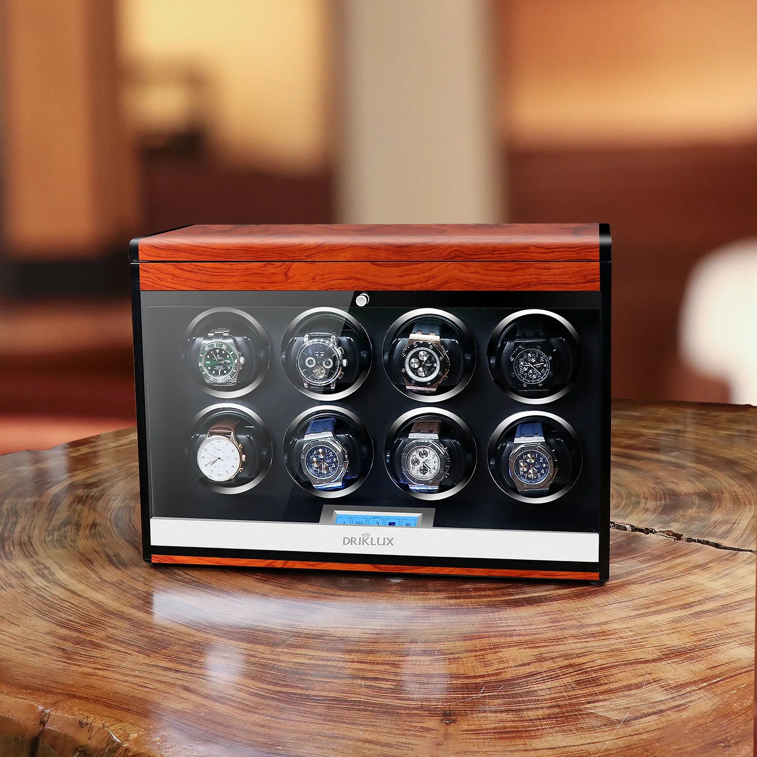
Overview and Key Concepts
Matching a watch winder’s wood grain to hardwood flooring and cabinets is about visual balance, not perfect duplication. The best collector-grade result comes from aligning undertones, grain intensity, and finish sheen so the winder looks intentional beside the room’s millwork rather than like a separate object.
For a serious collector, this matters because a premium winder is part display object, part mechanical utility: it sits in the same visual field as cabinetry, shelving, and flooring, and it should complement the room the way a fine watch complements a suit. In practice, the strongest pairings are usually warm-to-warm or cool-to-cool rather than trying to force an exact wood match.
A watch winder is often placed in a dressing room, study, or primary suite where finishes dominate the visual atmosphere. If the winder’s veneer is too red against walnut floors, too yellow against white oak cabinets, or too glossy next to matte millwork, it can look “added on” rather than integrated. Design guidance for cabinetry and flooring consistently emphasizes that grain movement matters as much as color; busy grain works best with cleaner grain, and refined grain can be paired with more character-rich surroundings.
That principle translates directly to watch storage. If your room already has strong cathedral grain in oak or hickory cabinetry, a winder in a restrained finish such as smoked walnut, satin ebony, or open-pore brown usually reads more upscale than another highly figured surface. If your space is minimalist with flat-panel cabinets and quiet flooring, a more dramatic veneer can provide the needed contrast without overwhelming the room.
-
Dark walnut floors + walnut or espresso winder
- Best when cabinets are also in walnut, mocha, or stained oak.
- Keep the winder a half-step lighter or darker than the floor so it doesn’t disappear completely.
- This is the safest match for traditional collections that include a Rolex Datejust or Submariner Date on the winder, especially if the room has leather, brass, or stone accents.
Many collectors benefit from understanding selecting a quality watch winder.
Professional collectors often choose Rolex watch winder recommendations.
Technical Specifications
Matching a watch winder’s wood grain to hardwood flooring and cabinetry is best done by aligning undertone, grain scale, and finish sheen rather than trying to find an exact species match. For collectors with Rolex references like the Submariner Date 126610 with caliber 3235, a Datejust 41 with caliber 3235, or a Daytona with caliber 4130/4131, the right winder should look like intentional furniture, not an accessory dropped onto a sideboard.
The cleanest result comes from matching the wood family and undertone first.
- Warm woods: cherry, walnut, mahogany, teak
- Cool/dark woods: ebony, wenge, smoked oak, dark stained ash
- Golden neutrals: oak, maple, birch, honey teak
If your flooring is a warm oak or walnut, a winder in cherry, teak, or walnut usually reads as cohesive. If your cabinetry is espresso or blackened oak, ebony or dark burl finishes tend to blend better. Orbita explicitly notes that its wood cases use natural veneers with visible grain variation, and that those variations are part of the product’s authenticity. That means you should expect some mismatch in grain from sample to finished unit, so select for tone and sheen rather than pattern perfection.
The grain on a winder should “speak the same language” as the room.
For detailed guidance, see our article on watch winder buying guide.
A quality caring for your Rolex timepiece makes a significant difference.
Expert Best Practices
Matching a watch winder’s wood grain to hardwood floors and cabinetry works best when you treat the winder as a third finish, not a perfect copy of the room. The strongest result usually comes from matching undertone and grain scale, then keeping the winder one step quieter or richer than the dominant wood in the space.
-
Match undertones first, species second. If your flooring and cabinets lean warm, choose a winder in walnut, espresso oak, or warm mahogany tones; if the room is cool, favor darker stained oak, ebony, graphite, or black lacquer with subtle grain. Design guidance on wood coordination consistently warns that exact matching can flatten a room, while tonal contrast creates depth.
-
Avoid “grain fighting.” If your cabinets have a strong cathedral grain or dramatic figure, select a winder with a straighter, tighter grain so the pieces do not compete visually.
-
Use the six-foot test. Stand back with the winder sample beside a cabinet door and floor sample; if your eye jumps between three different busy patterns, simplify one element.
-
Keep the grain direction consistent with the room’s architecture. Horizontal grains tend to feel modern and low-profile, while vertical or bookmatched faces feel more formal and furniture-like.
-
Treat the winder like fine casework. A satin finish usually blends better with hardwood cabinetry than a high-gloss finish, unless the room already has polished stone, lacquered millwork, or contemporary styling.
-
Traditional library or den: Choose a rich walnut or dark oak winder with visible but restrained grain. This pairs well with oak floors, raised-panel cabinets, and warm brass hardware.
-
Modern kitchen or dressing room: Use straight-grain walnut, smoked oak, or black-stained veneer. If cabinets are flat-front and the floor is visually active, a quieter winder prevents visual overload.
-
Transitional space: A medium-brown winder with moderate grain is often the safest choice because it bridges light flooring and darker cabinetry without looking pasted in.
-
Luxury showroom aesthetic: Deep espresso, piano black, or macassar-style grain creates a strong “object” presence, especially when the watch collection itself is the focal point.
-
Wolf is the benchmark luxury name most buyers recognize for presentation-grade winders, especially if you want a refined, giftable case aesthetic.
-
Orbita is known for practical engineering and a wide range of form factors, which appeals to collectors who prioritize function and consistency.
-
Smith & Rowe sits closer to the value-to-mid segment and can be a smart choice when the goal is matching décor without overspending.
-
Everest Bands is better known for straps than winders, but many collectors who own Everest accessories prefer a cohesive, high-end Rolex-friendly presentation across the desk, safe, and travel kit.
For budget planning, premium collectors often place decorative winders into a rough $50–$230+ decision band for entry-level to better-finished units, with prestige presentation pieces higher depending on materials, motors, and brand cachet.
Many collectors benefit from understanding how to choose a watch winder.
Professional collectors often choose triple wood watch winders for automatic watches.
Common Challenges
Matching a watch winder’s wood grain to hardwood flooring and cabinets works best when you treat the winder as a small but highly visible accent, not a perfect twin to the room’s wood. The biggest mistakes are chasing an exact match, ignoring undertone, and overlooking grain scale and finish; the fix is to coordinate species family, tone, sheen, and grain direction so the winder looks intentional beside the floor and cabinetry.
The practical rule is simple: if your flooring is the dominant wood surface, choose a winder that is one step lighter or darker and matches the room’s undertone rather than copying the floor exactly. Design sources on wood pairing consistently recommend avoiding near-identical tone matches, because the pieces can visually “blend wrong” or look accidental; instead, they recommend a coordinated contrast and repeating that wood tone elsewhere in the room for cohesion.
For example, a walnut winder usually pairs well with floors or cabinets that have warm, deep tones, because walnut is naturally dark and open-grained with a bold pattern. If your room has oak or hickory flooring with a strong, swirling grain, a similarly expressive winder grain tends to look more cohesive than a very tight, understated grain. If your cabinetry is maple or another closed-grain wood, a walnut or darker figured veneer can work as a deliberate contrast, especially when the room already has enough texture in the floor.
| Problem | Why it happens | Best fix |
|---|---|---|
| Exact-match obsession | Matching the winder exactly to floor or cabinets often makes the piece disappear or look “off” under different light. | Aim for a coordinated cousin: same warmth family, slightly different depth, and similar grain character. |
| Wrong undertone | A wood can read yellow, red, gray, or brown depending on finish and lighting, causing clashes even when the species looks close. | Check samples in morning, afternoon, and evening light before buying. |
| Grain-scale mismatch | A heavy, open grain beside a very fine, quiet grain can look disconnected. | Pair bold floors/cabinets with a more expressive winder grain, or pair subtle cabinetry with a cleaner veneer. |
| Finish mismatch | High gloss beside matte can make the winder look like a different product line, even if the color is close. | Match the sheen level: satin with satin, matte with matte, or intentionally contrast only if the room already has mixed finishes. |
| Too many woods in one room | Multiple unrelated species can make the space feel scattered. | Limit the palette to two or three wood tones in smaller spaces; repeat the winder’s tone in one other accessory if possible. |
| Ignoring visible placement | A winder on a dresser, cabinet top, or open shelf sits in direct view and competes with surrounding wood. | Treat the winder like a display object and choose a finish that complements the immediate backdrop, not just the floor. |
| Not using samples | Online photos distort hue and sheen, especially on walnut, rosewood-style veneers, and stained finishes. | Compare physical samples against the actual floor and cabinet door in the room. |
The most common visual error is confusing color family with undertone. A floor can look “brown” in a showroom but show yellow, red, or gray undertones in your home, which is why a winder that seemed perfect online can look mismatched next to your cabinets.
You can find more information about watch winder selection tips in our guide.
A quality 4 wood watch winders for automatic watches makes a significant difference.
Buying Considerations
Matching a watch winder’s wood grain to hardwood flooring and cabinets works best when you treat the winder like a furniture accent, not a standalone gadget. The most reliable approach is to match undertone, grain intensity, and sheen—not necessarily exact species—so the winder looks intentional beside the room’s millwork and flooring.
Wood looks cohesive when the undertones align: warm-toned floors and cabinets pair best with warm-toned winder finishes, while cool gray, ash, or white-oak interiors usually look better with cooler, muted finishes. Grain matters just as much: if your cabinets and floors have pronounced grain, choose a winder with visible veneer figure; if the room is cleaner and more contemporary, pick a tighter, straighter grain so the winder does not compete visually.
A practical rule from cabinetry and flooring design is to either match grain energy or create controlled contrast. For example, walnut flooring with rift-cut oak cabinets can look excellent if the winder uses a medium-brown walnut or smoked-oak veneer, while highly figured hickory floors usually call for a simpler, less busy winder finish to avoid visual clutter.
| Room condition | Best winder wood look | Why it works |
|---|---|---|
| Golden oak / honey floors | Honey oak, light walnut, satin medium brown | Keeps the room warm without creating a harsh mismatch |
| White oak / ash cabinets | Light oak, ash, matte sand, taupe veneer | Echoes the cooler, calmer tone of the room |
| Walnut cabinets | Walnut, espresso walnut, dark burl accents | Makes the winder feel built-in rather than added later |
| Cherry / red oak interiors | Cherry-toned, cognac, warm medium brown | Preserves the red-orange warmth of the space |
| Gray-stained or painted cabinets | Neutral charcoal woodgrain or black piano-gloss with restrained grain | Prevents the winder from fighting a modern, low-color palette |
For collectors, the exterior matters, but the movement spec matters more. Trusted brands such as Wolf, Orbita, Barrington, and bespoke makers like Andrew West and Enigwatch are widely positioned around cabinetry-quality materials, display-first design, and better engineering than no-name imports.
Many collectors benefit from understanding finding the perfect watch winder.
FAQs
What should I know about How to Match Watch Winder Wood Grains with Hardwood Flooring and Cabinets?
Matching a watch winder’s wood grain to hardwood flooring and cabinets is about visual balance, not perfect duplication. The best collector-grade result comes from aligning undertones, grain intensity, and finish sheen so the winder looks intentional beside the room’s millwork rather than like a separate object.
What are the most common mistakes to avoid?
The most common visual error is confusing color family with undertone. A floor can look “brown” in a showroom but show yellow, red, or gray undertones in your home, which is why a winder that seemed perfect online can look mismatched next to your cabinets.
What should I consider when buying?
If the winder is for a Rolex Submariner, Datejust, or Daytona, the exterior should be chosen for the room, but the interior program should be chosen for the movement. Many watch-winder guides note that Rolex, Omega, and Orbita-compatible pieces typically fall in the 650–900 TPD range, with 600–800 TPD often sufficient when direction is set correctly.
Conclusion
Mastering how to match watch winder wood grains with hardwood flooring and cabinets ensures your luxury timepieces receive proper care. By investing in quality equipment and following best practices, you protect your investment for years to come.
Product Gallery